

Time to Complete Module: 1 hour
Last updated: June 24, 2025
IN THIS MODULE
Each module in this guide includes instructions for building a specific page based on a sample design created by our Wix expert (Portfolio Website, Digital Agency, Local Business). You can switch to an alternative version of this module by clicking a different design in the left sidebar under “Alternative Designs.“
6.1 Hero Section
 We’ll include a hero section for this page with some text to ease the reader into the portfolio. Although the images will be the central focus of this page, jumping straight into the images with no introduction might seem jarring for some visitors.
Step 1: Copy the text section from the “Services” page.
We’ll include a hero section for this page with some text to ease the reader into the portfolio. Although the images will be the central focus of this page, jumping straight into the images with no introduction might seem jarring for some visitors.
Step 1: Copy the text section from the “Services” page.
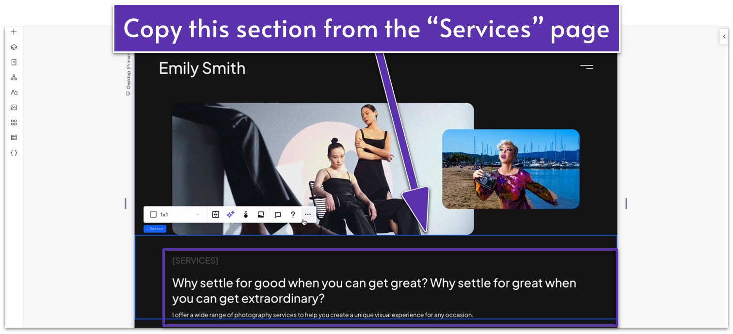 Step 2: Paste the section into this page.
- Remove the default blank section from this page.
Adapt for Tablet and Mobile Views
Since we copied this section from a previous one, it should already be optimized for mobile views.6.2 First Gallery Section
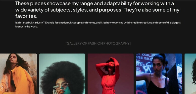
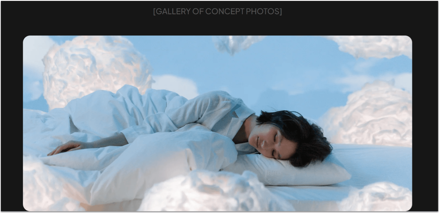
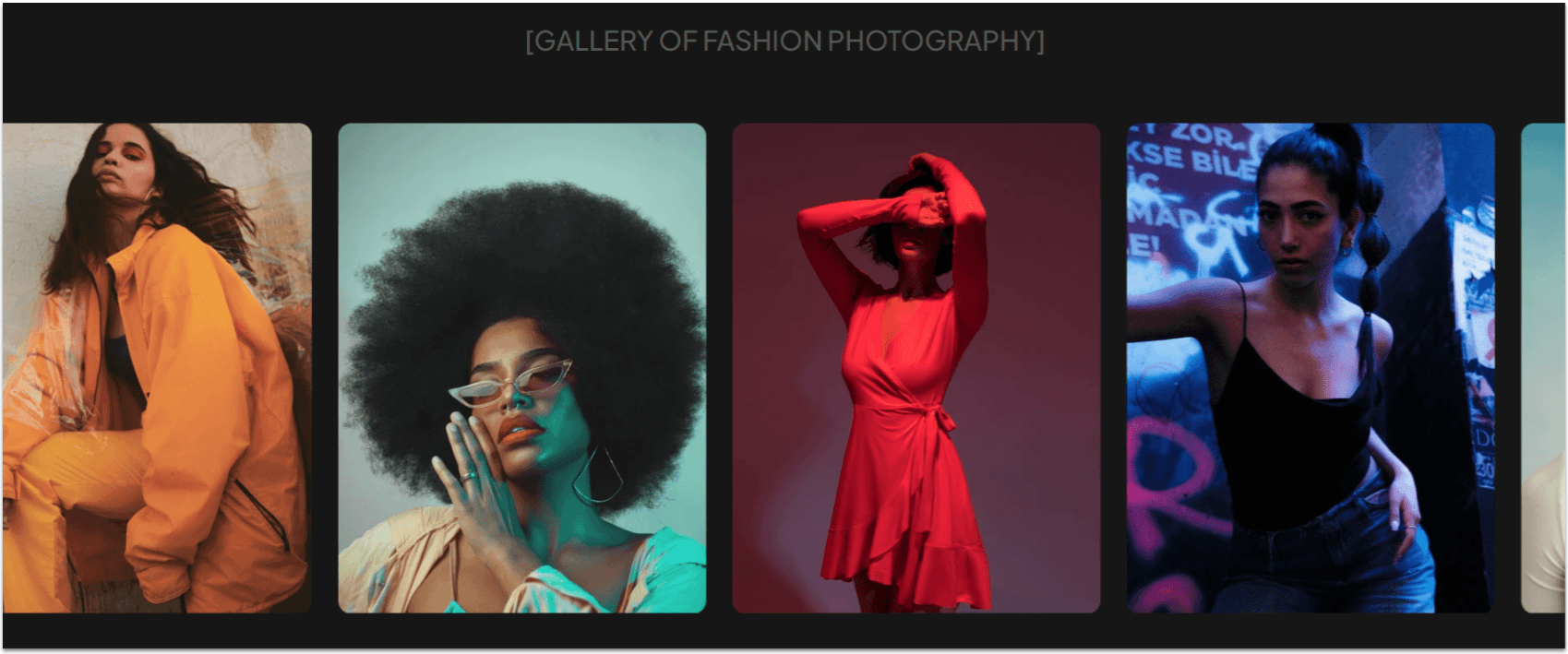 Since this is the portfolio page, we’ll let the images speak for themselves. That means we’ll limit text as much as possible and instead focus on including as many visually interesting photos as possible.
Though a photography portfolio can work just by displaying as many images as possible in a single format, we’ll include a variety of different galleries to increase the visual interest of the page. Our first gallery will be an infinite-scrolling gallery just like the one on the homepage.
Step 1: Create a new section and apply an advanced CSS grid to it.
Since this is the portfolio page, we’ll let the images speak for themselves. That means we’ll limit text as much as possible and instead focus on including as many visually interesting photos as possible.
Though a photography portfolio can work just by displaying as many images as possible in a single format, we’ll include a variety of different galleries to increase the visual interest of the page. Our first gallery will be an infinite-scrolling gallery just like the one on the homepage.
Step 1: Create a new section and apply an advanced CSS grid to it.- Set the top padding (
) for the section to an 80px scale. - Set the section’s layout to 1×2 (
). - Set the vertical gaps (
) for the section to 50px.
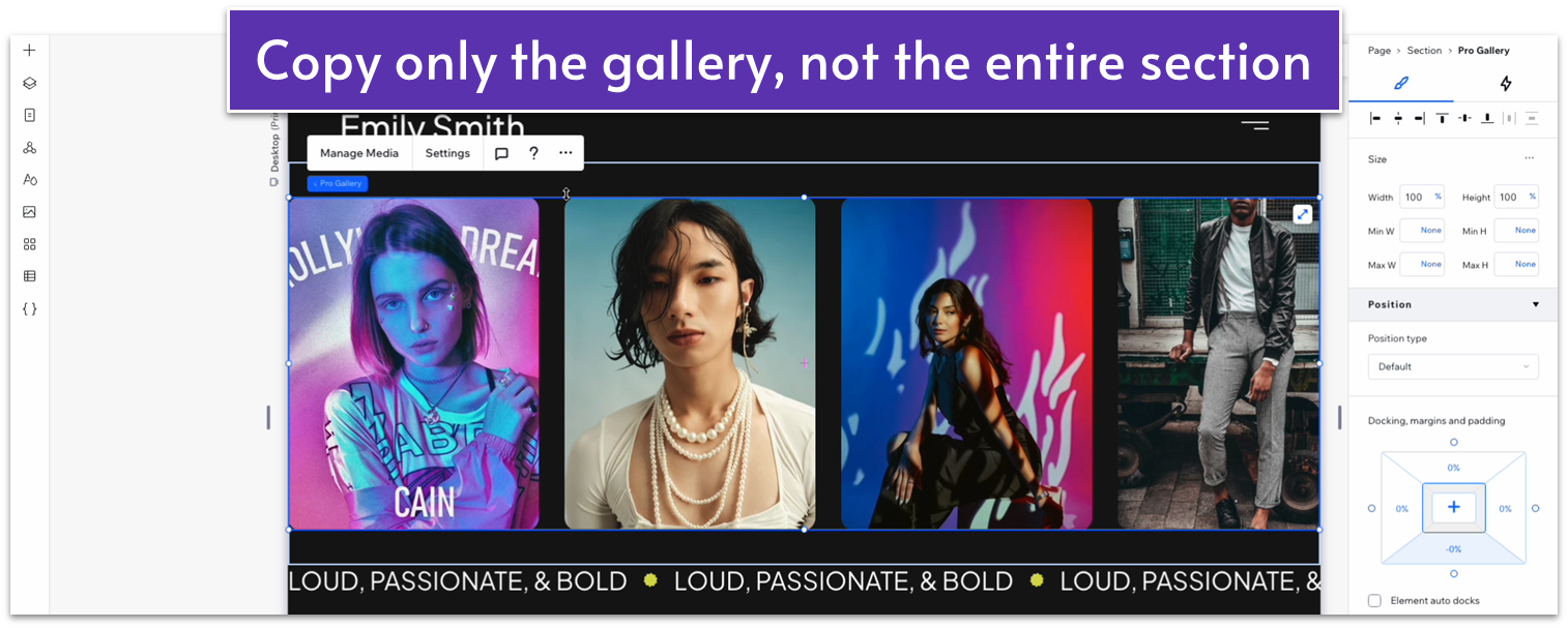 Step 3: Paste the gallery into the bottom row.
Step 4: Copy the gray heading from the section above and paste it into the top row.
Step 3: Paste the gallery into the bottom row.
Step 4: Copy the gray heading from the section above and paste it into the top row.- Set all margins to 0 (
, , , ). - Align the text to the center (
). - Replace the text with something appropriate.
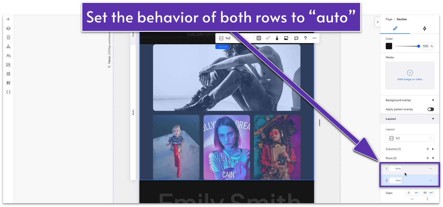
- Set the top row’s behavior to auto (
).
 Step 6: Replace the homepage images with the ones for this gallery.
Step 7: Toggle “apply max width” off from the section.
Step 6: Replace the homepage images with the ones for this gallery.
Step 7: Toggle “apply max width” off from the section.
Adapt for Tablet and Mobile Views
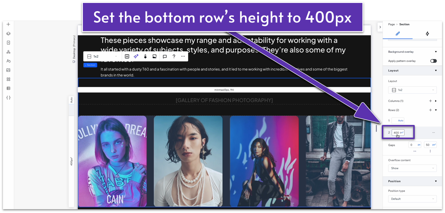
Step 1: Adapt for tablet view (- Set the top padding (
) for the section to a 70px scale. - Set the bottom row’s height to a 300px scale.
- Set the top padding (
) for the section to a 70px scale. - Set the vertical gaps (
) for the section to 30px. - Set the bottom row’s height to auto (
).
6.3 Second Gallery Section
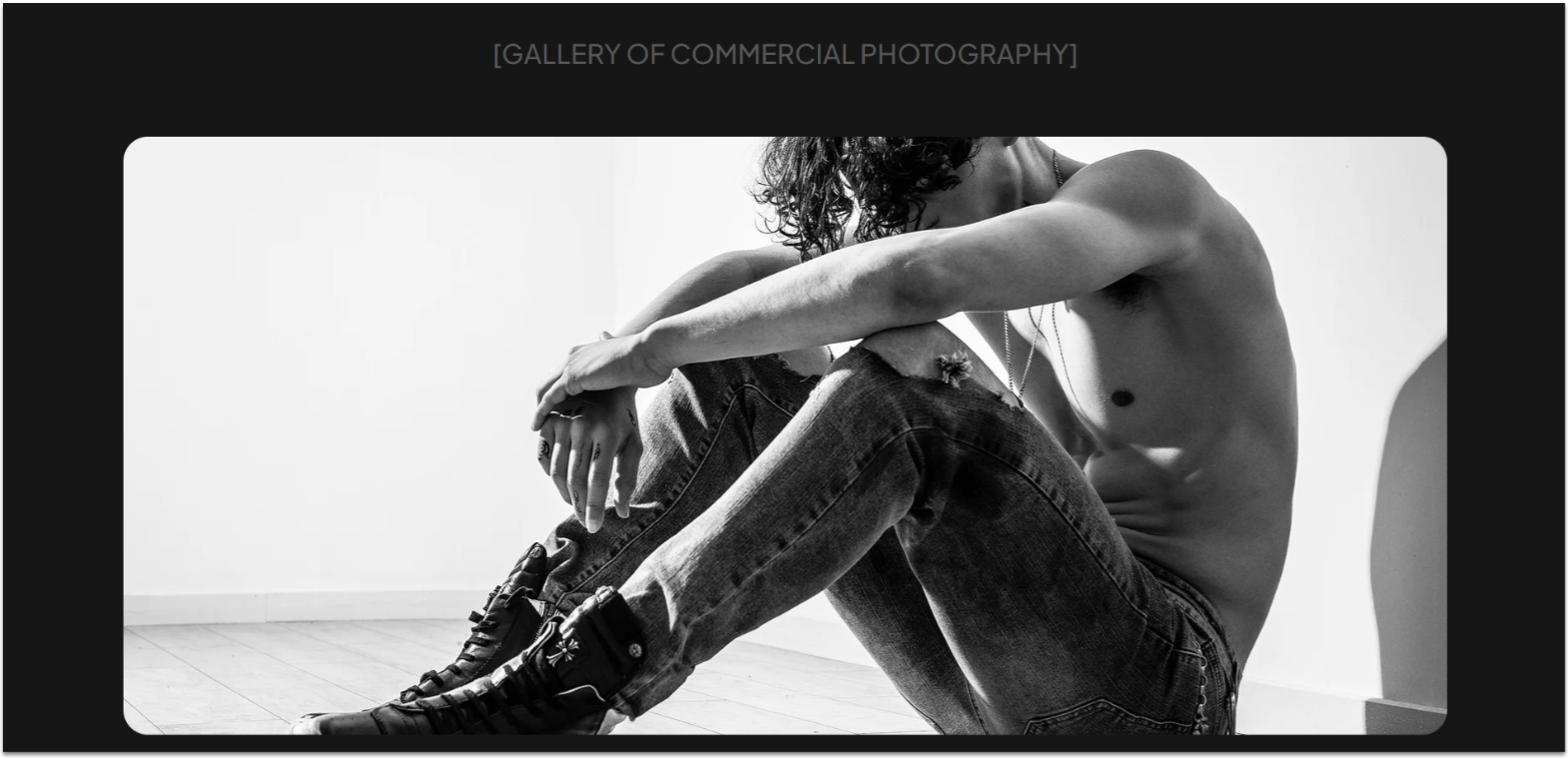 We’ll move on with a second gallery that we’ll use to display commercial photography. Instead of an animated gallery like before, we’ll include a static gallery with one landscape-orientation photo at the top and three portrait photos below.
Step 1: Duplicate the gallery section above.
We’ll move on with a second gallery that we’ll use to display commercial photography. Instead of an animated gallery like before, we’ll include a static gallery with one landscape-orientation photo at the top and three portrait photos below.
Step 1: Duplicate the gallery section above.- Change the heading to the title of the gallery.
- Set all margins to 0.
- Set the container’s width to 1080px.
- Remove the container’s background.
- Set the container’s layout to 1×2 (
). - Set the vertical gaps (
) for the container to 30px.
- Make sure to set its location in grid cells to the top row.
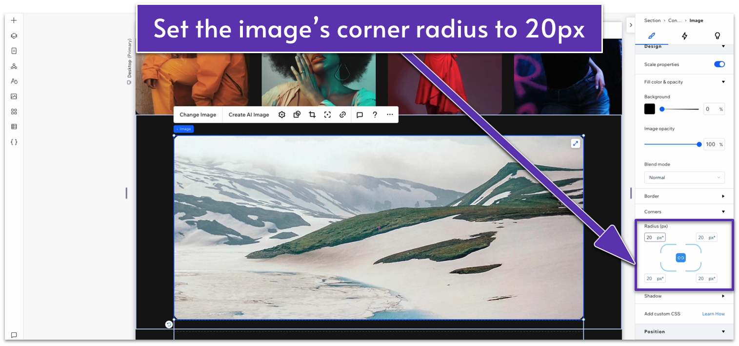
- Set all margins for the image to 0.
- Lock the image’s aspect ratio (
). - Set the image’s width to 1080px.
- Set the corner radius for the image to 20px.
 Step 5: Change the behavior of the bottom row of the section to auto.
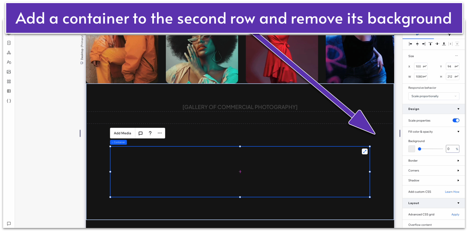
Step 6: Drag a repeater into the bottom row of the container.
Step 5: Change the behavior of the bottom row of the section to auto.
Step 6: Drag a repeater into the bottom row of the container.- Make sure its location in grid cells is set to the bottom row.
- Set all margins to 0.
- Set the repeater’s width to 1080px.
- Set the horizontal gaps (
) for the repeater to 30px.
- Remove the items’ backgrounds.
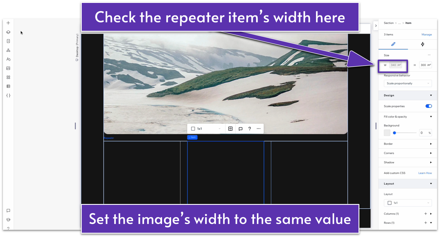
- Narrow the image so its width fits the item.
- Set all margins to 0.
- Set the image’s width to 188px and its height to 265px.
- Lock the image’s aspect ratio (
). - Click on the repeater item to check its width, then change the image’s width to match that value.
- Set the corner radius for the image to 20px.
Adapt for Tablet and Mobile Views
Step 1: Adapt for tablet view. On tablet view (- Set the behavior of the section’s bottom row to auto (
). - Set the container’s width to 720px.
- Set the behavior of both rows in the container to auto (
).
- Set the vertical gap (
) for the container to 20px. - Set the horizontal gap (
) for the container to 20px. - Set the corner radius for the top image to 20px.
- Set the corner radius for the images on the bottom to 20px.
- Set the vertical gaps (
) for the container to 20px. - Set the number of items per row for the repeater to 1.
- Set the vertical gaps (
) for the repeater to 20px. - Unlock the aspect ratio (
) for the top image. - Set the top image’s height to 250px. Then, lock the aspect ratio (
) again. - Unlock the aspect ratio (
) for the images on the repeater. - Set the height for the images on the repeater to 450px.
6.4 Third Gallery Section
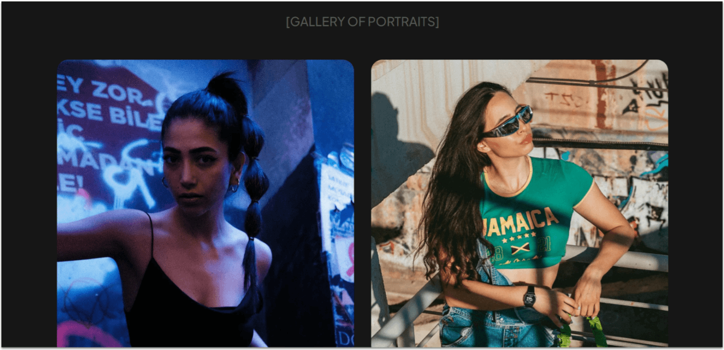 For our portrait gallery, we’ll go with a simple and symmetrical design.
Step 1: Duplicate the previous section and edit its elements.
For our portrait gallery, we’ll go with a simple and symmetrical design.
Step 1: Duplicate the previous section and edit its elements.- Change the title on the heading.
- Remove the container from the bottom row.
- Make sure its location in grid cells is set to the bottom row.
- Undock all margins and set them to 0.
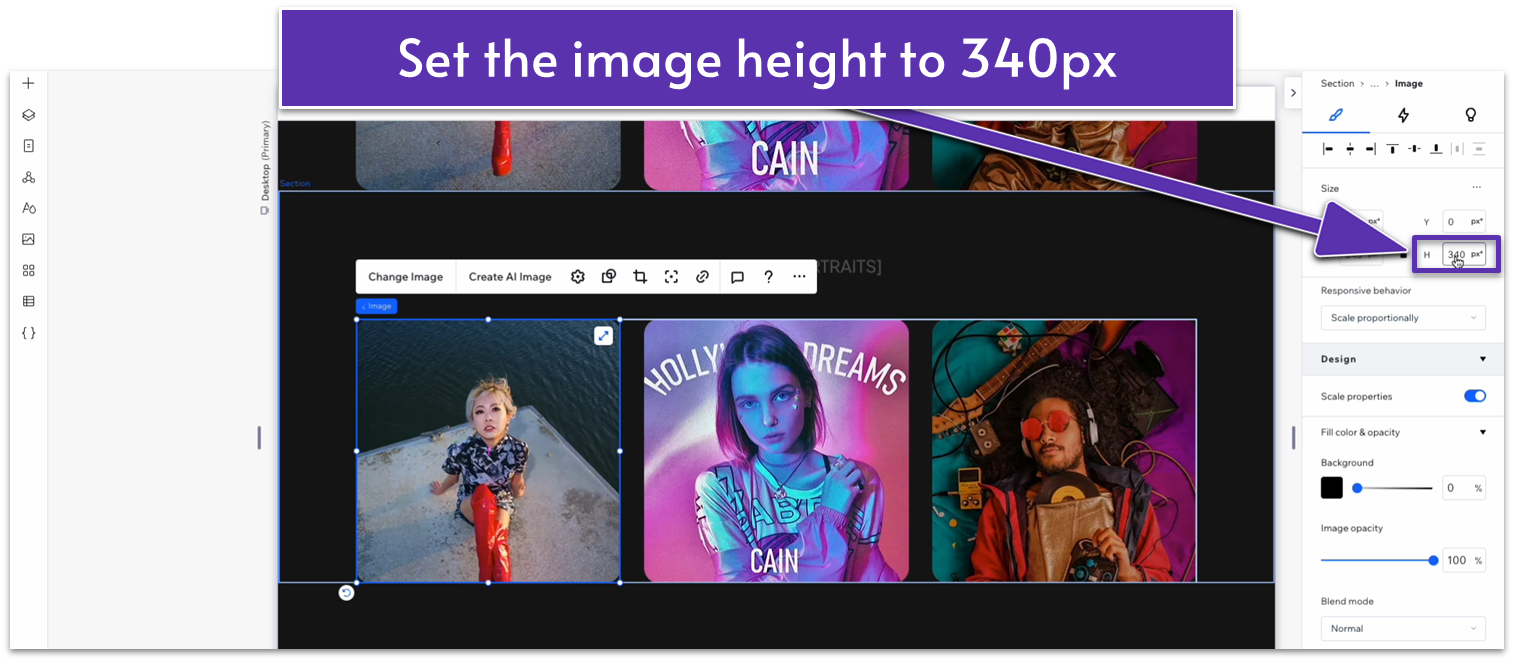
- Select one of the repeater’s images, unlock its aspect ratio (
), and set its height to 340px.
- Set the number of items per row for the repeater to 2.
- Set the vertical gaps for the repeater to 30px.
- Add another repeater item so there are four in total.
Adapt for Tablet and Mobile Views
Step 1: Adapt for tablet view. On tablet view (- Set the number of items per row to 2.
- Set the vertical gap (
) for the repeater to 20px. - Set the repeater’s width to 720px.
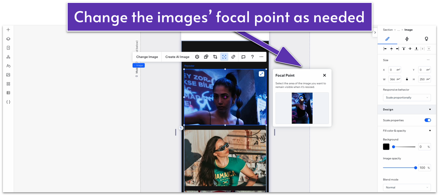
- Change the images’ focal points (
) so the most important parts remain visible on mobile view.
6.5 Fourth Gallery Section
 For the last gallery of this page, we’ll duplicate the second gallery and simply replace the content.
Step 1: Duplicate the second gallery.
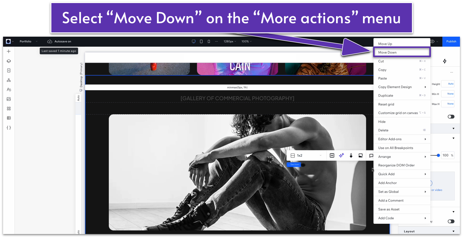
Step 2: Move the section down using the “More actions” menu.
For the last gallery of this page, we’ll duplicate the second gallery and simply replace the content.
Step 1: Duplicate the second gallery.
Step 2: Move the section down using the “More actions” menu.- Open the “More actions” menu (
) for the section. - Select “Move Down” to move the entire section down.
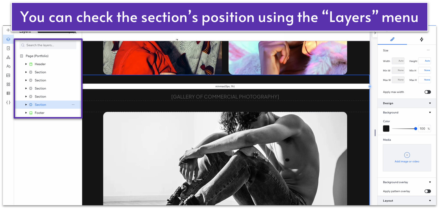
- Keep moving the section down so it’s at the bottom of the page. You can use the “Layers” menu (
) to check the section’s position.
 Step 3: Replace the section’s content.
Adapt for Tablet and Mobile Views
Since we created this section by duplicating one above, there’s no need to adapt further for mobile viewing.6.6 Contact Form
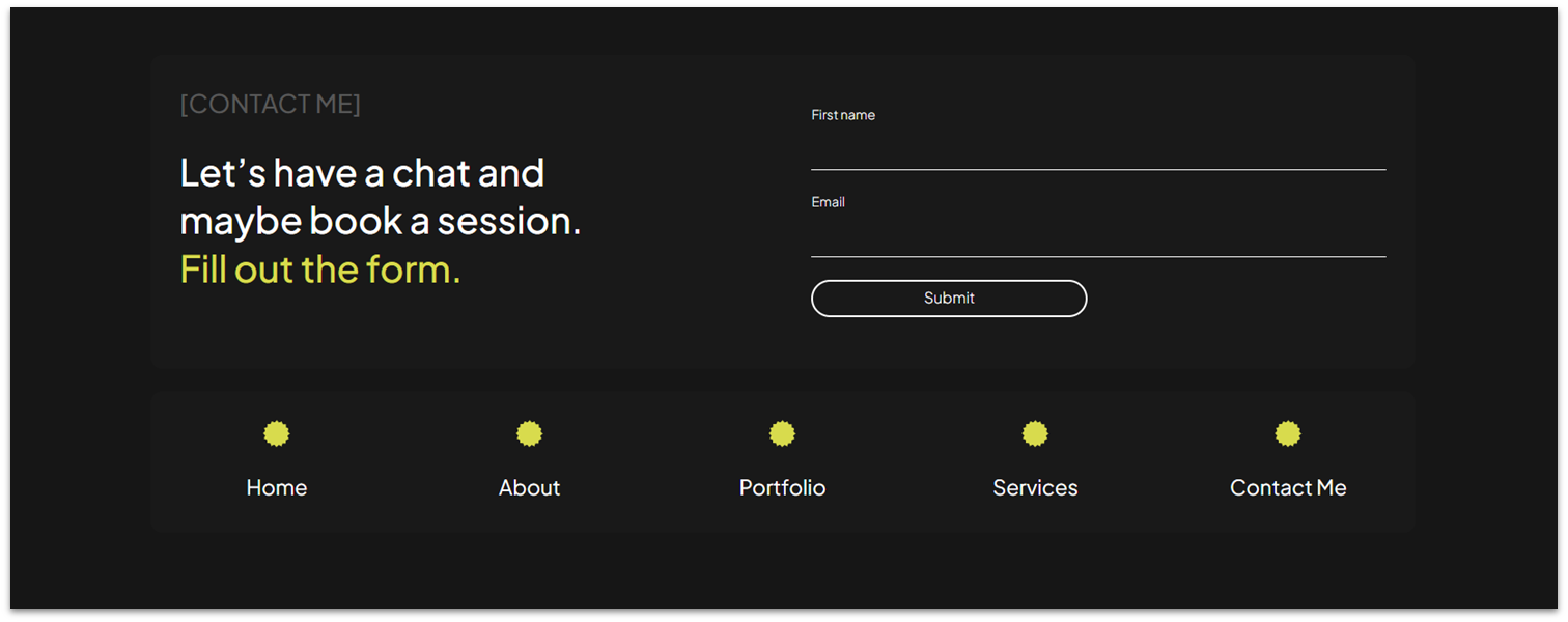 Let’s add the contact form global section at the end of the page. We already know how to go about this one — simply copy the section from the homepage.
